
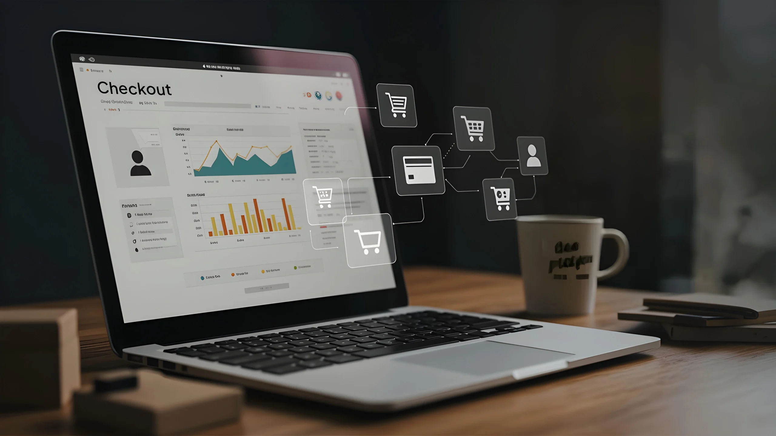
The WooCommerce checkout has always had a bit of a reputation. You can have a beautiful store, a high-quality product, even strong traffic, and still… people abandon the cart.
Most of the time, it’s not your pricing or product quality. It’s the checkout experience that’s killing conversions. However, we bring the good news with us. In this blog post, we’re sharing real-world UX hacks that have made a massive difference for our clients at BrandCrock.
Here’s what’s working right now.
1. Cut the Clutter Keep It Clean
The more fields you show, the more likely someone is to hesitate. Ask yourself: do you really need company name, second address line, or a required phone number for digital products?
In most cases, you can drop the extras. A clean checkout form keeps attention where it matters: finishing the purchase.
If you’re using a plugin like Checkout Field Editor, removing unnecessary fields takes minutes. You’ll notice the checkout starts to feel easier even though the user is technically doing less.
2. Guest Checkout Should Be the Default
Let’s be real: people hate creating accounts during checkout. It feels like a chore, and it’s one of the biggest reasons shoppers abandon their carts. So, skip the pressure. Let users check out as guests. Once they place an order, then offer to turn that into an account. It feels like a favor instead of a demand and it actually works.
This one tweak alone removes a major barrier, especially for first-time customers who aren’t ready to commit.
3. Make It Load Fast Especially on Mobile
A checkout page that takes 5 seconds to load is already too late. People expect things to just work, quickly, especially on their phones.
Optimizing checkout speed doesn’t require a full rebuild. Often, it’s enough to:
- Minimize scripts running on the checkout page.
- Avoid unnecessary animations or pop-ups.
- Use clean, performance-optimized themes and plugins.
Speed is not only about performance, but also about trust. A slow checkout feels sketchy. A fast one feels reliable.

4. One Page > Multi-Step
If your checkout process spans multiple steps or reloads, you’re giving users more chances to leave.
Try condensing everything into one page. That means:
- Billing/shipping details
- Payment options
- Order summary
All in one view. No tabs. No “Step 1 of 3.” Just a straight path from cart to confirmation. When users see the full picture, they feel in control, and they’re more likely to follow through.
5. Keep Users Focused
During checkout, you don’t want distractions. This isn’t the place to promote blog posts, up-sell related items, or advertise a summer sale.
Strip it down to the essentials: logo, form, summary, payment. Even something as small as hiding the main menu during checkout can help. It keeps attention locked on the goal, completing the order, and nothing else.
6. Use Real-Time Address Autofill
Typing full addresses is a chore. Mistakes happen. And on mobile, it’s even worse.
Add real-time address autofill using Google Places or similar tools. When a customer types “221B,” your form should instantly suggest “221B Baker Street, London.” It feels seamless, fast, and error-proof. Fewer typos mean fewer failed shipments. More importantly, it feels smooth, and users love smooth.
7. Trust Needs to Be Obvious
Buyers want to feel safe. So don’t just be trustworthy, show that you are.
Use trust indicators strategically. Think:
- Small lock icons near the payment fields
- Security badges from your payment processor (Stripe, PayPal, etc.)
- Clear mentions of return/refund policies under the “Place Order” button
These small touches don’t interrupt the process, but they do answer the quiet doubts people often have right before paying.
8. Total Cost Should Never Be a Surprise
Shipping costs, taxes, and fees should appear as early as possible not after someone has entered 10 fields of information.
If shipping depends on the location, let users estimate the total right from the cart or early in checkout. That way, they don’t feel tricked or blindsided at the last second. Clarity here builds trust. And when people trust your process, they buy more often.
9. Make Mobile the Priority, Not the Afterthought

Most shoppers today are on their phones. Yet many WooCommerce stores still treat mobile checkout as a secondary experience. Flip the approach.
Design for mobile first. That means:
- Big, easy-to-tap buttons
- Larger form fields
- No horizontal scrolling
- Sticky “Place Order” or “Continue” button
A mobile-friendly checkout doesn’t just help conversions it keeps your brand from feeling outdated.
10. Don’t Overwhelm with Payment Options
You want to give people choices but not too many. Offering every available method (PayPal, Apple Pay, Klarna, bank transfer, crypto, cash on delivery…) can clutter the interface and make buyers pause.
Instead, display the most common or relevant options based on user behavior or location. Hide the niche ones behind a “More options” toggle if needed.
11. Skip the Coupon Field (Or Tuck It Away)
Here’s a silent conversion killer: the giant coupon field. When someone sees “Have a coupon?” front and center, they often leave to look for one. Worse, they might not come back.
Solution: move the field to a small link like “Apply coupon”, tucked away neatly above the order total. It’s there for people who already have one, but it doesn’t shout at everyone else to go hunting for discounts.
12. Make the Final Button Reassuring
“Place Order” sounds cold and final. Instead, small tweaks to the CTA can make it more inviting.
Consider language like:
- “Complete My Purchase”
- “Pay Securely”
- “Finish Order”
It feels more personal and clear especially if you reinforce the benefit (like security or confirmation). Also, make sure the button is styled to stand out. Don’t let it blend into the page.
13. Post-Checkout: Don’t Just Say “Thanks”
Once the order is done, most stores display a basic confirmation message and leave it at that. That’s a missed opportunity.
Use the thank-you page to:
- Offer an account creation in one click
- Share delivery estimates or tracking info (if applicable)
- Add a personal message or brand touch, something more human than “Thank you for your order.”
Even better, follow it up with a clean, well-designed confirmation email that doesn’t feel like a system notification.
Final Thoughts: Don’t Copy Test
The hacks above worked for us, but that doesn’t mean they’re silver bullets. Your audience, product, and niche matter. Always A/B test where possible. But one thing’s certain: in 2025, the best checkout experience feels invisible. It just works. It doesn’t make the user think.
If you’re running WooCommerce and want to double your conversions, these UX improvements aren’t optional anymore, they’re expected.
Need help implementing some of these? That’s what we do at BrandCrock. Get in touch, and let’s turn your checkout into your strongest sales weapon.