
The shipping cost reveal that kills momentum
This is probably the most common checkout killer, and yet stores keep doing it.
Someone browses your products. Finds what they want. Adds to cart. Clicks checkout. Fills in their email. Enters their shipping address. And then—only then—do they see that shipping costs €15 when they were expecting maybe €5.
They leave. Of course they leave.
The problem isn’t necessarily that shipping is expensive. Sometimes it just costs what it costs. The problem is the surprise. People hate feeling tricked, and revealing significant costs late in the process feels like a trick even if that wasn’t your intent.
We see this constantly in stores that don’t show shipping estimates on product pages or cart. They’re worried that showing shipping costs early will discourage people from adding to cart. Maybe. But showing them late definitely discourages people from completing checkout, and that’s worse because you’ve invested more effort getting them that far.
The fix isn’t complicated. Show shipping estimates earlier. On product pages, in the cart, anywhere before they’ve committed time to filling out checkout forms. Let them decide whether the total price makes sense before they start investing effort.
If shipping genuinely varies too much to estimate, at least tell people that upfront. “Shipping calculated at checkout” is better than letting them be surprised. And if your shipping is expensive, own it and explain why. “We ship everything fully insured via DHL” gives people context that makes the cost feel justified rather than arbitrary.
The mobile form that fights you
More than half your checkout traffic is probably mobile. Yet we still see checkouts that feel like they were designed on a desktop and tested once on a phone as an afterthought.
Small tap targets that are hard to hit. Form fields that don’t trigger the right mobile keyboard—text input when you need numbers, no @ shortcut for email fields. Autocomplete that doesn’t work properly. Zoom that triggers accidentally when you’re trying to type. Error messages that appear below the fold so you don’t even see what’s wrong.
These individually are minor annoyances. Together, they make checkout feel harder than it needs to be. And when something feels hard, people give up.
The brutal reality is that if your checkout doesn’t work smoothly on mobile, you’re losing money every single day. Not because people prefer competitors, but because your own checkout is making it unnecessarily difficult for them to pay you.
Test your checkout on an actual phone. Not in the mobile view of your browser—on a real device, using your thumbs like a normal person would. Try to complete a purchase while standing up, with one hand, in mediocre lighting. That’s closer to how many of your customers are actually experiencing it.
If it’s frustrating for you, it’s definitely frustrating for them.
The account creation wall nobody asked for
Someone’s ready to buy. They’ve decided to trust you with their money. And then you tell them they need to create an account first.
Why? What purpose does forcing account creation serve at this exact moment other than adding friction?
We get it. You want customer accounts. They’re useful for marketing, for repeat purchases, for building relationships. But making them mandatory at checkout trades long-term potential for short-term conversion loss.
The best approach is guest checkout with an easy option to create an account after purchase. Let them complete the transaction first. Then, when they’re in the post-purchase good mood of having successfully bought something, offer to save their info for next time.
Some stores worry that guest checkout means losing customer data. It doesn’t. You still have their email, their order history, their preferences. You just don’t have a password. And honestly, most people would rather receive a login link via email than remember another password anyway.
Remove the friction. Let people buy from you without creating barriers they didn’t ask for.
The form fields that ask for too much
Every field you ask someone to fill out is a small barrier. Each one creates a tiny bit of friction and a tiny chance they’ll decide it’s not worth the effort.
So why are you asking for their phone number twice? Why do you need their fax number? Why does the company field matter for a personal purchase? Why are you asking for separate billing and shipping addresses when 80% of people use the same one?
We see checkouts that ask for 20+ pieces of information when 10 would do. Each extra field is costing you conversions.
The goal should be to collect the absolute minimum information necessary to complete the transaction. Anything else—marketing preferences, account details, optional information—can be gathered later or made truly optional.
Look at your checkout right now and ask for each field: “Do we absolutely need this to ship the product and process payment?” If the answer is no, remove it or make it optional. You’ll be surprised how many fields fail this test.
The error messages that don’t help
Someone fills out your checkout form. Clicks submit. Gets an error. The message says “Please correct the errors below” but doesn’t highlight which fields are wrong or what’s wrong about them.
Or worse: the error appears at the top of the page, but on mobile you’re scrolled down looking at the submit button, so you don’t even see the error. You just know it didn’t work and you don’t know why.
This seems like a small thing. It’s not. Unclear error handling is one of the biggest sources of checkout frustration we see in user testing.
Good error handling is specific: “Email address should include an @” not just “Invalid email.” It’s immediate: show the error as soon as someone leaves the field, not after they submit. It’s visible: put the error message right next to the problematic field, and make sure it’s visible without scrolling.
Bad error handling makes people feel stupid and frustrated. Good error handling makes them feel helped. The difference in conversion is measurable.
The payment options that aren’t there
You get to the payment step and the store only accepts credit cards. No PayPal. No digital wallets. No buy-now-pay-later options that are increasingly popular especially with younger shoppers.
For some customers, this is a dealbreaker. They don’t feel comfortable entering card details on a site they don’t know well. Or they prefer the buyer protection of PayPal. Or they specifically want to use Klarna to split the payment.
Different customers have different payment preferences, often for good reasons. Limiting options means limiting who can easily buy from you.
The counterargument is that too many options creates decision paralysis. Fair point. But there’s a balance between “here are 20 payment methods” and “credit card only.” Most stores should offer at least card payments and one or two popular alternative methods relevant to their market.
In Germany, that often means PayPal and Klarna at minimum. In other markets, it might be Apple Pay, Google Pay, or local payment methods. Know what your customers expect and make sure it’s available.
The security signals that aren’t visible
Trust is fragile at checkout. People are about to enter payment information on your site. If anything makes them hesitate or feel uncertain, they’ll bail.
Sometimes the trust issue is obvious—your checkout looks sketchy or unprofessional. But often it’s subtler. The security badges aren’t visible. The HTTPS padlock is there but you never mentioned it. Your return policy exists but isn’t linked from checkout. Your contact information isn’t obvious.
These small missing reassurances add up to a vague feeling of uncertainty. And uncertainty at checkout means abandonment.
Make trust signals visible and specific. Show security badges if you have them. Link to your return policy. Display contact information. If you have customer reviews, consider showing a few during checkout. Mention how many customers you’ve served or how long you’ve been in business.
None of this needs to be aggressive or over-the-top. Just present and reassuring. The goal is answering the unspoken question in every customer’s mind: “Is it safe to trust these people with my money?”
The loading times that test patience
Your product pages load fast. Your homepage is snappy. But checkout? Checkout takes 5 seconds to load each step. 8 seconds to process the payment. Another 4 seconds to show the confirmation.
People tolerate slower speeds when they’re browsing. They don’t tolerate it when they’re trying to complete a transaction. Slow checkout feels broken. It makes people worried that something went wrong. It creates just enough doubt that they abandon or close the tab and come back later (which often means never).
Checkout needs to be fast. Not just reasonably fast—actually fast. Under 2 seconds per page load. Instant feedback when buttons are clicked. Clear indicators when processing is happening so people know the system is working.
We see stores that have optimized their entire site for speed but never tested checkout performance. Then they wonder why conversion is low despite good traffic. It’s because the final step—the one that actually matters for revenue—is slow enough that people lose confidence.
Test your checkout speed on mobile, on a throttled connection, with realistic data. If it feels slow to you in ideal conditions, it’s definitely slow for your customers in real-world conditions.
The unexpected costs that appear at the end
Similar to shipping surprise but broader: You get through checkout and see taxes, fees, handling charges, or other costs that weren’t mentioned earlier.
The final total is 30% higher than the cart subtotal and you have no idea why. Maybe it’s legitimate—taxes have to be charged, processing fees exist. But if customers don’t know it’s coming, it feels like a bait-and-switch.
This is especially problematic for international customers who might face customs fees or VAT that wasn’t calculated in the cart. Even if you can’t control these costs, you can warn people they exist.
Show the full, complete price as early as possible. If that’s not feasible, at least explain what additional costs might appear and roughly how much. “Final price includes VAT and shipping, calculated at checkout” sets expectations. Seeing unexpected charges without warning does not.
People understand costs exist. They don’t understand or appreciate being surprised by them when they’re about to pay.
The mobile payment buttons that don’t work smoothly
Apple Pay and Google Pay are popular because they’re frictionless. One tap, authenticate with your face or fingerprint, done. When they work well, conversion rates are notably higher than traditional checkout.
But we see stores where these payment buttons are implemented poorly. They appear but don’t work reliably. They’re positioned oddly or hard to find. They timeout or fail without clear error messages. The confirmation screen doesn’t match what you ordered.
If you’re going to offer express payment options, they need to work flawlessly. A broken express checkout is worse than no express checkout because it wastes people’s time and creates frustration.
Test these flows thoroughly on multiple devices. Make sure the buttons are prominent. Ensure error handling is clear if something goes wrong. Verify that the order details shown in the payment sheet match what’s actually in the cart.
When express payments work smoothly, they’re a significant conversion boost. When they don’t, they’re just another point of friction.
The address validation that’s too aggressive
Address validation is useful. It catches typos, ensures deliverability, reduces failed deliveries. But overly aggressive validation creates problems.
Someone enters their legitimate address. Your system doesn’t recognize it—maybe it’s new construction, maybe it’s a rural area, maybe your address database is outdated. It refuses to accept the address or auto-corrects it to something wrong.
The customer knows their own address. When your system tells them they’re wrong, it’s frustrating. Some people will fight it and figure out a workaround. Many will just leave.
Address validation should suggest corrections, not force them. “Did you mean this address?” is helpful. “We’ve corrected your address” when the correction is wrong is not.
Similarly, phone number validation that rejects legitimate international formats, ZIP code validation that doesn’t account for regional variations, or form fields that don’t accept certain characters people have in their actual names—all of these create unnecessary barriers.
Validate to help, not to obstruct. And when validation fails, make it easy for customers to override if they’re certain they’re right.
The confirmation that leaves people uncertain
Someone completes checkout. The page changes. Did it work? They’re not sure. No clear confirmation appeared, or it was subtle enough they missed it. Their email hasn’t arrived yet. They can’t tell if the order went through.
So they submit again. Now they might have two orders. Or they leave uncertain whether to expect their package. Or they contact support to ask if it worked, creating unnecessary support volume.
Clear, immediate confirmation matters. Big, obvious “Order confirmed” messaging. Order number displayed prominently. Email confirmation sent instantly (not in 10 minutes, not when the order is processed—immediately).
Consider showing what happens next: “You’ll receive a shipping confirmation within 24 hours” or “Your order will ship tomorrow.” This reduces uncertainty and post-purchase anxiety.
The order confirmation page is also prime real estate for other things—related products, social sharing, referral programs—but don’t let those distract from the main message: “Your order worked. Here’s proof. Here’s what to expect next.”
The pattern behind all these leaks
If you’re reading this list and recognizing multiple issues in your own checkout, you’re not alone. Most stores have at least a few of these problems. Many have several.
The pattern is usually the same: checkout got built once, it worked well enough to ship, and then it never got the attention it deserved. Product pages get optimized. Marketing gets tested. But checkout just… exists. Doing its job adequately but not excellently.
And the cost of “adequate” checkout is significant. If your checkout converts at 25% when it could convert at 35%, that’s leaving 10% of your revenue on the table. For a store doing €500k annually, that’s €50k in lost revenue. Every year. From problems you might not even know exist.
How to find your specific leaks
Reading about common problems is useful. But your checkout has its own specific issues that matter for your specific customers.
The best way to find them is watching real people use your checkout. Not asking them hypothetical questions about what they’d prefer. Actually watching them try to complete a purchase.
This can be formal user testing with recruited participants. Or it can be informal—ask friends, family, customers to do a test purchase while you watch. Screen share sessions work. In-person observation works. The key is seeing where people hesitate, get confused, or struggle.
You’ll learn more from watching five people use your checkout than from staring at analytics for hours. Analytics tells you where people leave. Observation tells you why.
Also check your support tickets. How many questions are about checkout problems? What are people confused about? What errors are they running into? Your support team knows where the problems are—ask them.
Run test purchases yourself on different devices. Especially on mobile. Use different browsers. Try different payment methods. See what the experience actually feels like when you’re the one going through it.
Most checkout problems aren’t mysteries. They’re just things nobody’s paying attention to.
The fixes that matter most
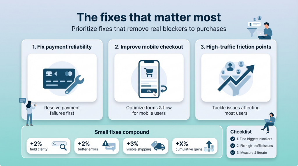
You don’t need to fix everything at once. You probably can’t. But you can prioritize based on impact.
Start with the most broken thing. If a payment method doesn’t work reliably, fix that first. If mobile checkout is genuinely broken, that’s priority one. Handle the things that are actually preventing purchases before optimizing the things that are merely suboptimal.
Then focus on the highest-traffic friction points. If 80% of your customers are on mobile and the mobile form is clunky, fix the mobile form before worrying about edge cases that affect 5% of users.
Small improvements compound. Fixing one field that was causing confusion might improve conversion by 2%. Improving error messages might add another 2%. Making shipping costs visible earlier adds 3%. Individually these seem minor. Together they’re the difference between mediocre and excellent checkout performance.
The stores with the best checkout conversion didn’t get there by implementing one magic trick. They got there by identifying and fixing many small problems until checkout stopped being a source of friction.
What good checkout feels like
Good checkout doesn’t feel like checkout. It feels obvious. Simple. Like there’s only one clear path and you’re being guided down it smoothly.
Fields are clearly labeled. The mobile keyboard shows the right type for each field. Errors are caught immediately with helpful guidance. Progress is clear—you know what step you’re on and what’s left. Loading is fast. Everything just works.
You’re never confused about what to do next. You’re never surprised by costs or requirements. Trust signals are present but not aggressive. Payment options are clear and they all work reliably.
And when you complete the purchase, you know immediately and definitively that it worked. No uncertainty, no doubt, no need to check email or contact support.
This sounds basic. It should be basic. But it’s rarer than you’d think.
The business case for fixing checkout
Checkout optimization isn’t glamorous. It doesn’t generate the excitement of a redesign or a new feature launch. But the ROI is often better than almost anything else you could do.
Marketing gets you traffic. Product pages get people interested. But checkout is where revenue actually happens. A 10% improvement in checkout conversion has the same revenue impact as a 10% increase in traffic, and it’s usually easier and cheaper to achieve.
We’ve seen stores increase revenue by 20-40% just from checkout fixes. No new traffic. No new products. Just removing friction from the final step.
That’s the opportunity sitting in your current checkout. Revenue you’re already earning some of, but leaving the rest on the table because of fixable problems.
If your checkout is leaking revenue
If you suspect your checkout is costing you conversions—and statistically, it probably is—you have options.
You can audit it yourself using the framework here. Go through your checkout as a customer would. Test on different devices. Watch other people use it. Identify the specific problems affecting your specific store.
You can use tools—session recording software like Hotjar, analytics that track checkout steps, A/B testing platforms to validate fixes. These help quantify problems and measure improvement.
Or you can bring in expertise specifically for checkout optimization. Not a full redesign, just focused work on identifying and fixing the friction points that are costing you money.
That’s work we do at BrandCrock. Taking the time to properly audit checkout flows, watching how real users interact with them, identifying the specific leaks affecting conversion, and systematically fixing them.
It’s not a months-long engagement. Often the biggest impact comes from a focused sprint—two to four weeks of concentrated work on the most impactful problems. The ROI tends to show up immediately in conversion metrics.
If that’s something you need, reach out. We’ll look at your specific checkout, tell you honestly what we see, and whether focused optimization work makes sense for your situation.
Because the goal isn’t selling you services. It’s helping you stop leaving money on the table. Your traffic is already there. Your products are already good enough that people want to buy them. Don’t let a leaky checkout be the thing that prevents those sales from happening.
Fix the leaks. Keep the revenue. It’s simpler than most optimization work and usually more directly impactful.
That’s the real opportunity here.